Wednesday, 14 December 2011

Gel Medium


This is my gel medium photo. It's a photo of my friend looking like a 'bad' girl (type of clothing and type of shoes) and doing something you wouldn't think she would be doing which is reading a book in the library about the game CHESS. 

I had lots of fun doing this photography process and i would LOVE to do it again and again. I loved when you were finished with the thousands of layers of glue and you put it in the water to take the paper away, and you start seeing the photo, it's a good feeling. It lets you know you did it right and not only did you do it right, you did it goooooood.

I love the way this process works. It seems so complicated in the end when other people that haven't done it before see it a go 'WHOA THATS SO COOL HOW'D YOU DO THAT' and you say 'well, i'm a genius is all'. The funny part was that I was one of those people............

ANYWAYS i wish you could have felt and looked at my gel medium in person but i guess that won't work! I hope you like mine anyways. Enjoy!

Monday, 5 December 2011

Silk Screen Printing


So for the first process I did silk screen printing. The first photo is of the whole shirt with the design printed 3 times. The second photo i took is just to see the 3 designs closer and in more detail (sorry that it`s not straight and you`re going to have to tilt your head). This photo is of my friend looking like a `nerd` but lighting a cigarette. I went with a classic and made my message `Don`t Judge A Book By It`s Cover` aka `Don`t Judge A Person By The Way They Appear`. I used this message by using a person doing something you wouldn`t think they would do.

I really loved doing this process (silk screening) because their are so many steps you learn and every step is fun. Stapling the fabric, putting on the emulsion, rubbing the picture on the silk screen, everything was useful to learn and i loved it very much. I would like to use this process anytime for anything.

Saturday, 12 November 2011

MIxed Lighting


This photo is of mixed light of my friend Maddie. She was sitting at the top of the fence and the sky looked pretty, so did she, and by using the flash on the camera i took this picture making a certain type of studio lighting, mixed lighting. I did mixed lighting by using the regular outside sunlight with the flash light from the camera.

Sunday, 6 November 2011

Painting With Light


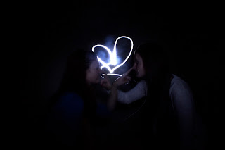
This are two photos I took using painting with light. Even though we only needed one photo, I couldn't decide which one I liked better and decided to show you BOTH.

In the first one of Maddie, by using the flashlight, I shined it over her head in circles a couple times to make a halo and then shined light on her to show her face. By doing this I made Maddie an angel.

In the second one of Sara and Maddie, using the flashlight, I stood behind them in the middle and drew a heart as they posed in a very cute adorable way and then shined light all over both of them so you could see their pose. By this it made them look cute like good friends that love each other!

I loved painting with light because you can make any sort of pattern or writing using the flashlight and any pose. I really think this is a great way to learn different ways to photograph things/people. Enjoy!

Friday, 4 November 2011

Renaissance Photo

Marchesa of Mantua
Portrait of: Isabella d'Este
Artist: Titain
Date: 1534-1536

The Renaissance
The Renaissance was a cultural and scholarly movement which stressed the rediscovery and application of texts and thought from classical antiquity, occurring in Europe c. 1400 – c. 1600. The Renaissance can also refer to the period of European history spanning roughly the same dates. The Renaissance was a movement dedicated to the rediscovery and use of classical learning, that is to say knowledge and attitudes from the Ancient Greek and Roman eras.

Titain, The Artist
Tiziano Vecellio, Titian, was an Italian painter, the most important member of the 16th-century Venetian school. He was born in Pieve di Cadore, in the Republic of Venice. During his lifetime he was often called da Cadore, taken from the place of his birth.
The Painting
Isabella d'Este was shown as a young woman, Isabella was 62 by the time the work was painted. Titian had originally painted a more aged Isabella, but she was so displeased with the picture that she made him repaint it in an idealised form, so that she looked forty years younger.

Monday, 24 October 2011

Studio Lighting: Perfect Lighting


First I would like to start by saying, aren't my models beautiful?

These series of pictures are represented as perfect lighting. My photos go from lightest to darkest but you can clearly still see every detail in their face with hardly no shadows. The first photo (Sara) is used with all lights turned off except for one. I adjusted the light in a way to make the photo dark but yet you can still see Sara'a radiant face! The second photo (Maddie) is taken with all the lights off besides two. The main lights were turned off while 2 sets of the same light was on. By me moving the lights around i got a beautiful photo of Maddie with a "medium" light. The last photo (Sara & Maddie) is used with all lights on meaning the main light and two other lights shining on them. Not only can you see both their faces clearly, their are no shadows on their faces.

In every photo their are practically no shadows and you can see their faces very clearly in a dark light a "medium" light and a bright light.

Saturday, 15 October 2011

NAME, GRACE MAC.


In this photo, I took 8 photos using objects and nature to make 1 picture spelling my name.

First Name...
G: The lower case g is made up of 4 Japanease tea cups and a Japanease tea holder. The tea holder is used for the top portion circle and the 4 tea cups are placed upside down to form the bottom loop.
R: The lower case r is the end of a hat. I cut out by cropping the rest of the hat by just showing the ending for the hat making a lower case r.
A: The capital A is parts of a picture frame. The picture frame could hold 5 photos and by cropping out the rest of the frame and only using the right corner, it forms to look like an A.
C: The lower/capital C is a part of a alarm system. It fell and when it was on the floor, it looked like a c. It is the part that covers the battery.
E: The capital E is a part of a cupboard. In the middle right is the handle to open the cupboard  and on the cupboard it has lines and a design to make it look like a capital E.

Last Name...
M: The lower/capital M is made up of the bottom of two wooden chairs. As you can see the two chairs (the part where you sit and the back. The M is made up of the legs that hold the chair up.
A: The capital A is the top part of a fire extinguisher rotated to look like a capital A.
C: The lower/capital C is made up of 4 remote controls that form a c.

As you can see, I made every picture black and white then shaded out the parts that form the letter so it really stands out to the viewer. Then I set the background to black.

Sunday, 18 September 2011

i wish...


This is the Fountain of Trevi in Rome. This picture was taken by a tourist who i am GREATLY jealous of. I have many dreams and wishes in the world and one of them is to go to Rome. My parents have the money to go and say it would be a great adventure but we have still never gotten the chance too. If/Whenever i go to Rome my life will probably be complete. Out of ALL the great places in Rome i chose the Fountain of Trevi because i've always seen this place in movies and TV shows i adore very much. This picture inspires me to actually do good in school. Why would the Fountain in Trevi in Rome inspire me to do better in school you may ask yourself? Well, it's because school leads to college/university, college/university leads to a good job, a good job leads to money, money leads to... ROME! Preferably I would like to go when I'm older with friends for family. So basically, I adore this picture or ANY picture really of Rome because it makes me happy and it lets me dream about the future.